


Maintenance Guide to Cleaning and Care: Composite Cladding
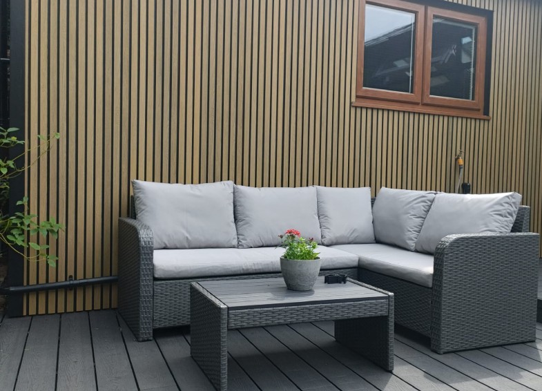
Colour is a way to breathe emotion into a design and blend a bit of your personality into your home. While the logical aspects of a project can be reasoned with, altered, and shaped, colour is a statement. It’s you.
Colour is often the most important aspect when it comes to choosing suitable exterior cladding. The dimensions and specifications of a project set the physical boundaries for your space, but finding the perfect shade can ‘make or break’ a project at a moment’s notice.
However, choosing a colour is about more than what you see offered on a website; it is important to envision how it will fit within the makeup of your specific space. Matching your window frames, the brick walls, or the lush greenery of your garden all plays a vital role in selecting a suitable colour to complete your build.
In this guide, we will explore the range of available colours and trends on the market today, providing expert tips on how to find that perfect shade and prevent disappointment long after installation.
Grey shades (particularly darker tones such as ‘Anthracite Grey’) have long dominated the market in popularity amongst homeowners. However, in recent years, the cladding market has seen a massive shift away from that trend toward warm, natural colours.
This surge in popularity is owed to the rise in consumers opting for Garden Room extensions, bringing the natural bloom and tone of the outside, within.
While still a staple for contemporary designs, darker greys have been overtaken by oaken, brown tones for wall cladding. Homeowners are leaning towards rustic, natural vibes, seeking the organic warmth of timber for their walls—without the heavy maintenance requirements of real wood.
Before selecting your shade, it is important to be aware that colours can differ slightly between manufacturing batches. Manufacturers produce composite cladding in large batches of the same components, so a cladding board produced six months prior may have slight, visible differences in shade compared to what is purchased today.
To avoid this issue, ensure you purchase enough cladding for your entire project in one order. This will provide you with an exact matching set of boards from the same batch, preventing headaches down the line.
Expert Tip: Always ask for a current sample ahead of your purchase. Batch variation also applies to the samples themselves. Ensuring you have an up-to-date reference for your cladding material can avoid delays and disappointment.
Below, we explore the top popular colour trends across the market, providing some pros and cons to help narrow down your choice.
Boasting a sleek, deep, and modern appearance, anthracite grey cladding shades closely compare to the RAL 7016 colour of its namesake, perfectly complementing the bi-fold doors and window frames of modern homes across the UK. Mirroring your cladding with your existing doors creates a seamless transition and provides a high-end finish. Darker shades of grey also provide practicality, easily hiding watermarks and dust spots that would be much more apparent on lighter shades.
While Anthracite is bold, lighter and mid-tone greys have been a highly popular choice for almost a decade. Offering a highly complementary appearance, these shades provide a modern blend that easily matches or contrasts with both dark and light architectural features. A classic grey wood grain cladding instantly modernises any garden project with its cool, contemporary aesthetic.
Lighter greys can visually enhance the space, reflecting more natural light to create a brighter, larger-looking area.
Seeing a surge of demand for rustic, natural colours, these vibrant, organic tones closely mimic the feel and warmth of traditional timber or softwood cedar cladding. Teak composite cladding the #1 choice for summer houses and garden rooms, these colours work harmoniously within your garden space, enhancing your home with the comforting vibe of a log cabin resort.
Trendy Tip: Oak shades contrast beautifully with black or dark grey window frames. The darker frame draws colour from the surrounding area, promoting the vibrancy of the warmer tones
Rising rapidly in popularity, dark brown cladding cerate’s a rustic warmth that provides a relaxing, welcoming feel to your project. These deep tones effortlessly blend the authentic look of natural wood into your garden without the grueling yearly upkeep of staining or painting. Note on naming: You might wonder why we bundle these shades together. Because composite cladding focuses heavily on authentic wood replication, different providers use various names—like Walnut, Chocolate, or Dark Brown—for very similar shades. Because these hues vary slightly from brand to brand, ordering a physical sample is always our top recommendation.
Charcoal and black shades are seeing a rapid rise in popularity for wall features. Offering a striking, minimalist look, these cold tones act as an elegant backdrop. Black composite cladding offers a bold colour, bringing a sophisticated shine to your garden by enhancing what already exists. Leafy greens and vibrant blooms ‘pop’ against the striking, shadowy background. Black shades also hide dirt and marks exceptionally well, making it a forgiving choice for high-traffic areas.
An important factor to consider is that colours behave differently depending on the type of board you purchase. Composite cladding comes in two main variants: Uncapped and Capped.
With uncapped cladding, the wood fibres in the material are exposed and porous, meaning it is more prone to natural weathering. Colours will lighten by roughly 30% of their original shade in the first 6 months. This is a normal, natural stabilising period as the wood adjusts to sun exposure.
Layered with an external protective ‘cap’, this variant is heavily shielded against UV rays, providing increased fade resistance. The original colour is expected to hold for decades without noticeable change. If you want to strictly maintain the exact colour of the sample you received, capped is the safest bet.
Darker colours, such as black and anthracite grey, absorb and retain significantly more heat than lighter shades. While you avoid the discomfort of walking on it (unlike decking), the thermal expansion caused by this heat must be factored into your installation. If choosing a dark colour that will be subject to high amounts of sun exposure (such as a south-facing wall), it is absolutely critical to leave the correct expansion gaps between boards and ensure your ventilation cavity behind the cladding is adequate to allow trapped hot air to escape and prevent buckling.
It is also worth noting how lighter colours perform under the sun. Lighter shades naturally reflect UV rays, meaning they absorb less heat and are cooler to the touch.
Expert Engineering Note: While heat retention is a critical comfort and structural issue for composite decking (since it sits horizontally absorbing direct midday sun and is walked on barefoot), it is much less of an issue for vertical wall cladding. However, in our experience, lighter uncapped boards may show a slightly more noticeable initial colour transition than darker boards as they go through their natural weathering phase.
The “Sample to Site” Test: Compare and contrast the sample directly against your outside wall. Envision how it melds with the existing architecture. Warm browns might flatter your painted walls, while clay brickwork might benefit more from a cooler grey.
Sunlight Shines Clarity: Colours vary significantly when exposed to the light of day. Ensure you view your sample in the exact space it will be installed, checking it in both direct sun and shadows to see the true reality of the board.
Composure or Contrast? Do you want the cladding to blend in or stand out? Knowing this early is vital. Teak slatted cladding against dark border composite fence can make your summer
Maintenance Guide to Cleaning and Care: Composite Cladding
